
This royalty-free photo is brought to you by Pixabay.
It’s National Novel Writing Month, AND I AM EXCITED.
In the spirit of the month, late last night I found myself wandering the cavernous digital hallways of Pixabay, searching for stock photography to use for a prototype book cover for my NaNoWriMo novel, The Bearers. If you don’t know Pixabay (most of my graphic designer friends do), I suggest you get to know Pixabay. It’s a wealth of high-quality royalty-free images you can use without penalty for just about anything, including commercial use (see: book cover art). There are plenty of stock photography services out there (Shutterstock is a big one) but a lot of the time you have to pay a membership fee. I’m mentioning Pixabay because it’s 100 percent free to use.
Yes, if I was going to be sitting in front of my computer at 11 p.m. last night, I probably should have been writing. Instead I decided to exercise another creative outlet: graphic design. (This one’s more like a hobby for me, and I’m honestly not very good… still learning the fundamentals. If you want to see real dedication to the craft of graphic design, check out my friend and superstar Karli Foss’s stuff. She is the terrific artist responsible for crafting the perfection that is the cover artwork of my Tanzania memoir.) My late-night graphic design experiment led me to think about what goes into creating a good book cover, if you’re going to design your own. I highly recommend going the professional route if you can afford it, especially if you have a superstar graphic designer friend. But if you are going to give it a go and design a cover yourself…
Ultimately, in my opinion, you want your cover art to do two main things:
1. Look good.
Straight up. You want the elements of your cover art – images, text, etc. – to have a cohesive, attractive balance. I always find that less is more; keeping it simple and clutter-free is one of the best approaches you can take with a cover. Use fonts that are easy to read (avoid Comic Sans and Papyrus like the plague) and really think about what text you need on your cover. Be sparing with text. Treat your images with care. If you don’t really know how to use Photoshop without it being painfully obvious in the end result, just don’t use it.
Of course we judge books by their covers. It’s the very first impression of your story that a person formulates, and terrible cover art scares away readers before they even open your book. Do you want to tell me you’d take precious hours out of your week to read any of these books? Or these? (Real book covers, by the way.) Maybe you would, I don’t know. That is a whole other set of issues entirely.
2. Tell something about your story… but not too much.
You don’t want your cover to mislead readers. Keep it true to your genre (no robots on the cover of a historical romance novel… unless… nope, won’t go there). Avoid trying to be too avant garde with your concept. Covers that border on the slightly abstract or vague are fine if and only if they contribute to the narrative you’re trying to tell. You don’t have to give the ending away or even show a scene from your book on your cover; that said, a cover with artistic elements that harmonize with the content of your novel (or even just the summary on the book jacket) will draw readers in, if they are able to make that association before they read your book.
This is definitely a personal preference, but one of my favorite examples of cover art is the cover artwork for Gregory Maguire’s books. If you don’t know Gregory Maguire, his novels are reworkings of traditional fairytales, often from an antagonist or auxiliary character’s perspective. (He’s the author responsible for Wicked: The Life and Times of the Wicked Witch of the West, which eventually became a hit Broadway play… you might have heard of it.) The artistic styling of his book covers has become almost a brand, and the covers paint a clear picture without giving the entire story away. For examples of slightly more abstract covers, here is a great photo gallery of “The Best Book Covers of 2015 (so far)” by Frannie Jackson of Paste Magazine. Not on this list, but still an example of a simple cover at its finest, is ROOM, by Emma Donoghue. These covers may not give the story away, but they still tell the story. They tell potential readers SOMETHING about what they will find inside.
Not sure? Find help.
There are numerous articles out there in the Interwebs with tips and tricks to designing a stellar book cover. A lot of them are very thorough, and most of them give you the same basic advice: keep it simple, avoid certain pitfalls (there are a lot of lists and examples out there), and don’t use images from Google search.*
*The last point is extremely important. If you don’t take anything else with you from this blog post, remember this one. If the image you find belongs to an artist or designer and the image has been appropriated without their permission, that is stealing. Even if you found the image on a secondary site, if it wasn’t attributed to the image’s owner, you can be held liable for copyright infringement. Don’t learn this the hard, expensive way. Use Pixabay.
And of course, ask your friends. Definitely ask your graphic designer/superstar friends. Ask strangers on the bus. Ask anybody what they think. Feedback is important. Look at it as a free focus group study. You’re doing research. Come at it objectively. Use any criticism you receive constructively, and don’t take it personally. Knowing what even a random sample of people think of your cover is invaluable information to have at your disposal. It allows you to make the best possible decisions about marketing your book… especially when you’re publishing it yourself. That is why I’m putting my “masterpiece” online, for all to see.
So here it is, the conceptual cover art for my NaNoWriMo novel, The Bearers.
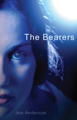
© 2015 by Jen Anderson. All rights reserved.
I’m currently using this on my website and on my NaNoWriMo novel page, but it’s by no means the finished product.** I love the simple image of a person who resembles one of my main characters. For context, I may inset a small, faint illustration of an important location in the story, in one of the corners. Please feel free to shoot me an email and leave your feedback… I welcome feedback! I crave feedback. Help.
The original subject is a nameless lady in a free Pixabay photo, with absolutely no relation to Kristen Stewart (to my knowledge). I was worried this would read a little too Twilight, but ultimately it’s just a prototype cover. I would like to know if there is too much resemblance to Bella Swan before I market this image too much or go ahead and print 500 books with it (that’s way, way down the road, of course). On second thought, I’d certainly be MUCH better off having Karli do it.
**2/4/17 UPDATE: Since this post, I’ve actually changed the cover art for The Bearers, to a slightly retro-style cover design that faintly reflects the science fiction book covers of the 1970s and 1980s (which have been an endless source of inspiration for me). You can view the new cover art here.
BLOG HOME


